Hi Crafters!
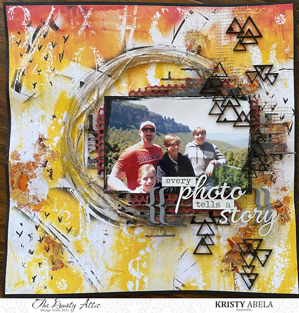
I really enjoyed the Mood Board this month. I found some amazing masculine themed paper in the new releases from 13@rts. There is a more laid back set and this one here is aimed at teenagers. Its not often we get young male inspiration and this new release is page after page of great ideas. I loved the composition on this piece and really let the paper speak for itself. All it needed was some dimensional accents from our favourite Dusty Attic chipboard and some clever composition. Instead of talking about how I decorated the chipboard I thought I would give you some tips and hints on composition. Let me know on our Facebook page if they help!


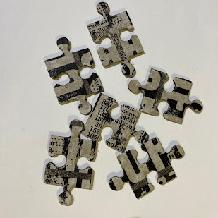
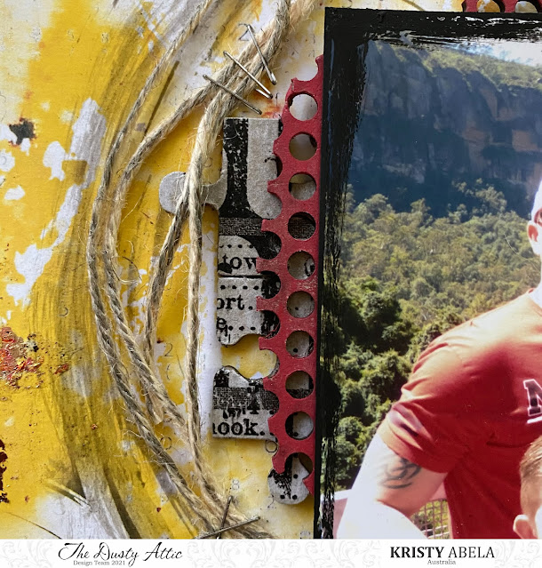
I treated myself to something new from the Tim Holtz release and found this tissue paper. Perfect for my puzzle pieces! I used Gel Medium to stick it down and used a light spritz of water to peel off the excess once the underneath layer of Gel medium was dry. Then I added another layer to seal it. Either gloss or matt gel will do the job. If you don’t have any Tissue paper you can always paint the chipboard pieces white and use your favourite stamps to get a similar effect!


I really wanted to highlight the circle in the background and use it as the frame for my composition. You will notice that I haven’t added any dimensional accents on the left hand side so the eye is really drawn to the collage within the circle. To enhance it I used some regular old string, brushed some water based black dye, and a few staples… Nothing says teen grunge like dirty water and bits of metal!
I matted the background with black Bazzil to frame the composition and I used my finger to run some black paint around the edge of the photo. This created two black square-ish shapes on the page. Repetition of shapes helps create cohesion and also framed the photo in amongst all the bright colours to draw the eye to what was important.

To give the chipboard some place to ‘sit’ I created a neutral texture in the background with my favourite accessory, Plasterers tape!! I love this stuff because you can cut it at different angles to create some amazing shapes. It also helps to give your mediums something to stick to. Can you see the the gold leaf flakes? How cool are these and they give a touch of an electroplated influence to a page. Can you see how the mesh tape in the background gives it a place to rest? I applied the tacky glue with a pallet knife and because of the ridges you can get a really random effect when you brush off the excess.

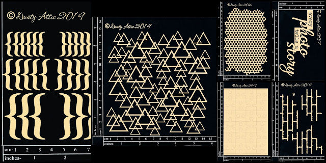
I wanted to colour the chipboard to tie in with the background palette. Because it is so bright, adding more colours would confuse the focal point. In this composition we have used black and white as part of our palette. When creating with bright colours we need to ‘calm the page down’ at some point otherwise our eyes get overwhelmed. Without black and white to do this, grey becomes a great option as a neutral! To break up the layers of chipboard I added some interest by dabbing texture paste on the Broken Bits – Bricks with a brush. I added some variation of colour with chalk paints. If you don’t have texture paste you can add some sand to acrylic paint and get the same effect.
A plain white title on top of all the crazy was all I needed to finish it off. See how I used the Grey again to frame what was important on the page?
I hope that you gained some clever tips to help with your next project.


